graphic design in the 1920s

In the 1990s, as the new digital media and networks were emerging, it became obvious that graphic design was the core discipline through which the components of the new media could be integrated, designed and presented.

Graphic design is a twentieth-century discipline that drew upon the 500 year-old traditions of printing and publishing, the 19th century developments in advertising, poster design, and photography, and the early 20th century innovations of a swathe of influential designers.

1923_EL-LIssitsky_Electro-Library_c

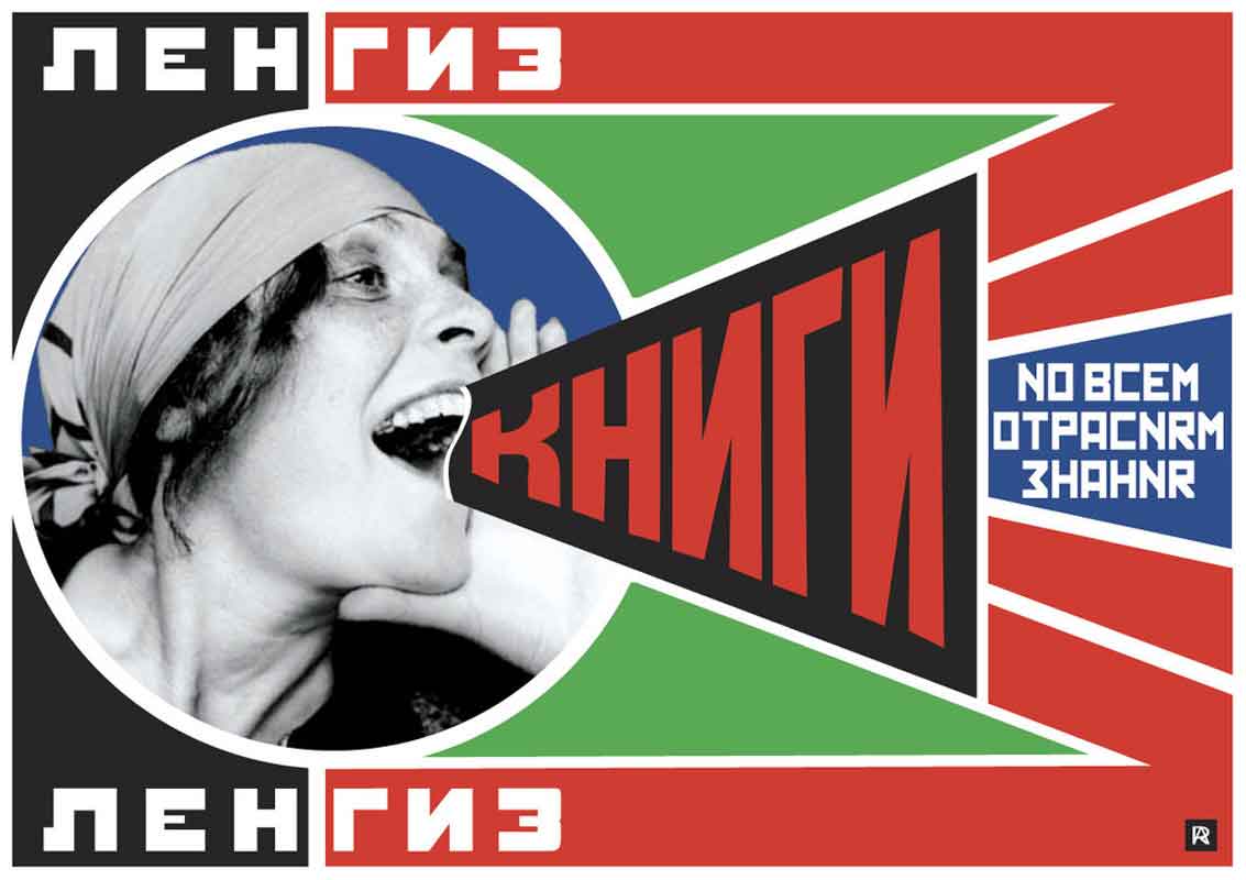
El Lissitzsky: Electro-Library! 1923 This fascinating poster, designed by El Lissitzky in 1923, is indicative of the revolution in print design in the 1920s. El Lissitzky is one of the great prototypical designers of the early 20th century. He epitomises the designer who is familiar with the latest reprographic technologies, and in his stage and exhibition-design he is already mapping the territory that will be fully explored in the latter half of the century, and in this, and his own philosophy of art/science/technology, firmly based on mathematics, he has become an exemplar for current multimedia designers. El Lissitzky sits alongside the greatest designers of the 20th century. Along with Rodchenko, Moholy Nagy, Tschichold, Rand, and half a dozen others, these designers set the agenda for the blend of information-design, graphics, photo-collage and combinations of typography and photography that now dominates both design education and current practice in the digital arts. His astonishing, and as Hans Magnus Enzenberger points out (in Towards a Theory of New Media 1970), at the time virtually incomprehensible suggestion of: “The future of book design resulting as an Electro-Library (what is that?). from the poster: “the design of the bookspace through the material of the process block, which creates the new optics. the supernaturalistic reality of the perfected eye. the continuous page-sequence – the bioscopic book. the new book demands new writers. Inkwells & goose-quills are dead. the printed page transcends time and space, the printed page, the infinity of the book, must be transcended. THE ELECTRO-LIBRARY!

1925_Rodchenko_Battleship-Potemkin_poster_c

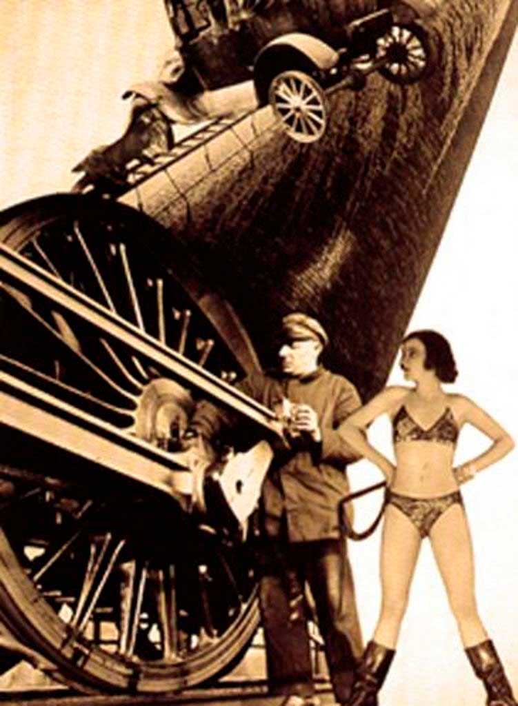
Alexander Rodchenko: poster for Battleship Potemkin 1924 Rodchenko became an early master of the integration of typography and photography. It’s hard for a young 21st century designer, used to working entirely in the digital domain, to understand the technical difficulties of producing this kind of work in the 1920s. There were two main ways of making these graphic works: Making a photomontage with printed type and with photographs, then having a half-tone plate made of the entire graphic, and overprinting with extra colours and with a separate overprinting with letterpress display fonts. Or secondly, it would be pheasible to have halftone plates made for the contone (photographic, continuous-tone) components, and physically cut the zinc plates, before mounting them on type-high pywood for printing. To retain the sharp letterforms, an overprinting of the type would be the final printing.

1925_Rodchenko_Books!_c

Rodchenko: Books! with his photograph of Lily Brik A master of type-design using the bold cyrillic display faces of the 1920s, this poster by Rodchenko has become an icon of the period, perhaps even more so than Dziga Vertov’s fim The Man with a Movie Camera (1929), or Sergei Eisenstein’s Battleship Potemkin (1924)

These designers, from Peter Behrens and his ground-breaking identity for AEG (1906-1914), to the DADA artist-typographer Raoul Hausmann, and the De Stijl artists (1917-1920), to Lazlo Moholy Nagy at the Bauhaus, Alexander Rodchenko in civil-war Russia, Fortunada Despero in Italy, Karel Tiege, Piet Zwart, Jan Tschichold in other parts of Europe, plus the influence of DADA, De Stijl, Surrealism, Russian Agitprop, (etc) all contributed to the emergence of the new profession.

1918_Hausmann_DADA_issue-1_c

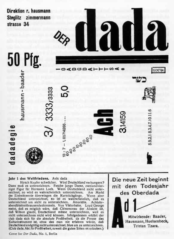
Raoul Hausmann: DADA issue 1 1918 the DADAists were the first to really break with 19th century conventions of type-design and typography. Here Hausmann uses display fonts, body-copy fonts and printer’s furniture (the rules, blocks, logos and symbols) to make an assymetric design, that was a radical redefinition of page-design.

Other important ingredients in this emerging discipline  (not really to be called ‘graphic design’ until the 1950s) included late 19th century designers like William Morris, Frank Lloyd Wright, Charles Rennie Mackintosh, Aubrey Beardsley, the Beggarstaffs, Alphonse Mucha, Henri Toulouse Lautrec, Arthur Macmurdo, (etc).

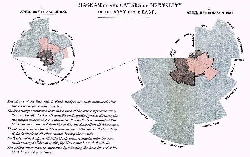
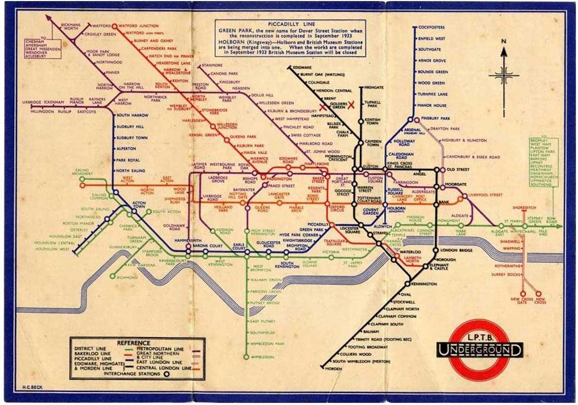
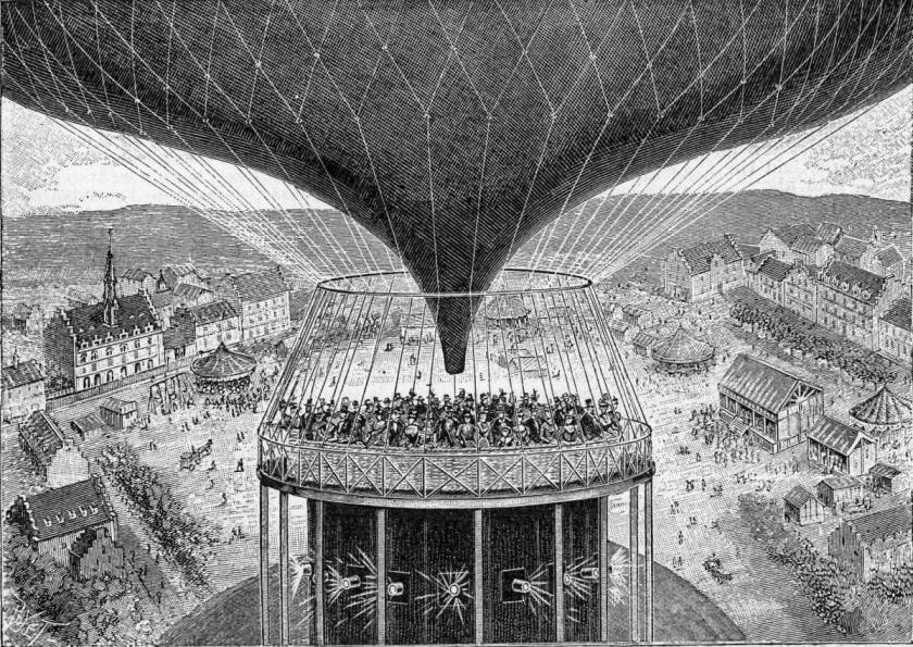
And of course, the emerging information sciences of the 1920s and 1930s played a core role in informing the graphic design of statistical information (Otto and Marie Neurath: Isotypes (1930s); and geographic information (Harry Beck: London Underground Map 1933, Phylis Pearsall: London A-Z, 1936), and information taxonomies (the work of Paul Otlet in the 1930s).

All these various ingredients, together with innovations in letterpress, hot-metal, photo-gravure, halftone, trichromatic colour printing, (etc) informed the new industrial-design of graphic artefacts.

Recently, in its digital iteration, graphic design has embraced the moving image, animated typography, even the use of sound and music. It has become the design discipline that above all others, integrates all these multimedia components, and information-design, as well as becoming the art underpinning the graphical user-interface and screen-based content design generally.

I’m planning more detailed posts on individual designers, as well as on the development of all the component media of the 21st century media-ecology.


Maya Deren: Grid of Stills from Maya Deren films 1944

1944_Deren_grid-of-stills_cThis post-board or mood-board of stills from Deren’s work, assembled by her in 1944, includes stills from Meshes of the Afternoon, Choreography for Camera, At Land, and Ritual in Transfigured Time. A prolific artist, dancer, choreographer, film-maker, Deren embraced the skill-set that came to represent avant garde American film-making in the post-war period, forming a kind of archetype for the counter culture.

John Brunner: The ‘Club of Rome’ Quartet 1975

John Brunner was one of the new generation of sci-fi writers who emerged in the late 1960s, and whose work was show-cased by Michael Moorcock in New Worlds Science Fiction. This new wave was characterised by innovations in form and in content. Brunner had spent his early career writing space-opera style sci-fi, whereas from 1967-68 onwards he focused on issues relating to the very sad state that the world had found itself in. By this time, the issues of over-population, pollution, the nuclear arms race and the power of the military industrial complex had become a major concern to the world’s youth. Brunner was to tackle these issues, incorporating them into his partially non-linear writing structure, in books that were later described as his ‘Club of Rome‘ Quartet.

1975_Brunner_Club-of-Rome-Quartet_c

Brunner’s Club of Rome Quartet: Stand on Zanzibar (1968), Jagged Orbit (1969), The Sheep Look Up (1972) and The Shockwave Rider (1975)

The Club of Rome was a group of academics, providing research and investigation into global issues, and attempting to catalyse a change in our thinking, and by 1972 they had commissioned a detailed computer simulation of the world, its resources, its population, and run simulated projections to determine the impact of diminishing resources and increasing population. The projection was called ‘Limits to Growth‘. The simulator was based on Jay Forrester’s World Dynamics model evolved in the late 1960s from his earlier development of System Dynamics.

The Club of Rome stated its objectives as early as 1968: “The club states that its mission is “to act as a global catalyst for change through the identification and analysis of the crucial problems facing humanity and the communication of such problems to the most important public and private decision makers as well as to the general public.”

The Limits to Growth report, coming a decade after Rachel Carson’s Silent Spring (1962) – the book that alerted us all to concerns about what we were doing to our environment -in a sense catalysed 10 years of mind-change. By the early 1970s Richard Buckminster Fuller had already begun his World Resources Inventory, and described his World Game idea (1964). Stewart Brand had piublished his Whole Earth Catalog (1968). All these were attempts to raise public awareness of these pressing environmental issues – as was the creation of Friends of the Earth and Greenpeace over this period (1969-72). Brunner was incorporating these concerns in his zeitgeist books. The final book in this Quartet, The Shockwave Rider dealt more with the emerging trends in world communications networks, phone phreaking, computer virus’ (Brunner called them Worms), hacking and online identity-shifting. Shockwave Rider (inspired by Alvin Toffler’s Future Shock 1972) became the definitive British contribution to the Cyberpunk genre of science-fiction, a genre characterised by Venor Vinge’s True Names (1978), William Gibson’s Neuromancer (1983), and Bruce Sterling’s Islands in the Net (1988).

William Gibson describes Brunner’s work: “No one except possibly the late John Brunner, in his brilliant novel The Sheep Look Up, has ever described anything in science fiction that is remotely like the reality of 2007 as we know it.”[1]

Shockwave Rider had a major impact on me and my generation.

Cynthea Brazeal: Kismet Affective Robot 1999

Cynthea Brazeal is associate professor of Media Arts and Sciences at MIT. She is a pioneer of social robotics – the investigation of how to make a robot capable of responding to social intercourse with humans  with some of  the signature facial expressions that mirror the ‘human qualities’ of social exchange, understanding, and empathy. Kismet was an early illustration of Brazeal’s doctoral thesis – on Affective Robotics – at MIT AI Lab from 1999.

“Kismet is an expressive robotic creature with perceptual and motor modalities tailored to natural human communication channels. To facilitate a natural infant-caretaker interaction, the robot is equipped with visual, auditory, and proprioceptive sensory inputs. The motor outputs include vocalizations, facial expressions, and motor capabilities to adjust the gaze direction of the eyes and the orientation of the head. Note that these motor systems serve to steer the visual and auditory sensors to the source of the stimulus and can also be used to display communicative cues.”

(http://www.ai.mit.edu/projects/sociable/baby-bits.html)


2011_Hanson-Robotics_affective_c

David Hanson:Diego San Robotic Baby Boy 2011

Considerable effort in the research community has been put to the development of human-like robots, the smart (AI-based) software that drives them, and making the prosthetic ‘front-end’ – the eyes, face, mouth, voice etc – that is the effective and hopefully affective user-interface of the robot – what you see, how you gauge understanding, how you apply the Turing test etc. David Hanson (of Hanson Robotics) has produced some remarkable prototypes illustrating progress in this area since Kismet.

What exactly is the relevance of Kismet to the world of film?

We are heading rapidly towards the scenario in which sophisticated CGI and AI software – a development of what is happening right now in Pre-Viz and Games software – enables us to create feature-length movie-experiences in which several or even most of the protagonists are not just soft-machines (like us humans), but are really software-machines – a CGI developed ultra-realistic humanoid soft-robot or cyborg equipped with a sophisticated software-brain, with a built-in expert-system style memory retrieval mechanism, chatbot-style conversational capabilities, and other AI allowing it to keep in-character, and play its part in relevant plot development. Importantly these synthespians, virtual-actors (vactors) or digital dramaturges, will be equipped with the kind of algorithms developed by Cynthia Brazeal and David Hanson – they will be able to assume human characteristics, facials expressions and affective responses relevant to their fictional characters. Eventually of course, real actors will sell the software rights to their individual portfolio of personal motion-capture-data, expression-capture data, likeness-data, allowing movie-makers to cast (say) Richard Burton (in his prime) with Gloria Swanson (in her prime) with Peter Lorre (at his best) and Brad Pitt (at 20 years old) together in the same movie – the ultimate casting machine. Bit-parts and crowd scenes supplied by future generations of Massive Prime’s crowd-simulator, the whole locked together into movies using the catalog of virtual cinematography effects that we have already begun to develop.

Fritz Kahn: Respiration (top) and What goes on in our heads when we see a car and say car? 1939

Fritz Kahn: What goes on in our heads when we see a car and say car? 1939

Kahn’s fascinating information graphics from the 1920s and 1930s have become motifs for the industrialism and mechanisation of the period – the result of Fordism and the idea of the man-machine, production-line, time-and-motion, rationalisation of work – essentially making man fit in with machine-age capitalism. Kahn’s beautifully intricate graphics echo the zeitgeist that is also illustrated (and summoned) in Raoul Hausmann’s Spirit of Our Times (1921), Chaplin’s Modern Times (1936), Lang’s Metropolis (1927), and Karel Capek’s Rossums Universal Robots (1921), etc, etc.

1921_Raoul-Hausmann_Spirit-of-the-Age_c

Raoul Hausmann: Spirit of the Age 1921

The fact that Kahn’s work tended to solidify and ratify the mechanistic rationale of how our body and senses work, and that this was the model that determined how many of us (of my generation at least) were taught, makes you wonder at the cybernetic and computer-processing metaphor that is the current zeitgeist model of how we work. It’s inevitable, I guess, that we use these descriptors as metaphors – explaining the complex in terms of the simple. I was aware of this image long before I discovered that it was by Fritiz Kahn. It appeared uncredited in films and prints by Eduardo Paolozzi (History of Nothing, 1960) and Stan Vanderbeek (Science Friction, 1959).

If you’re interested in Fritz Kahn and his work, there’s a great monograph on him by Ute and Philo von Debschitz (Taschen, 2013).

Bob Cotton: Zeiteye 2010

Bob Cotton: Zeiteye 2010

This is a short film I made 2009-2010. It was a way of dramatising an archive database – a database film as Lev Manovitch called it. Its intent was to illustrate the changing zeitgeist of the previous 11 decades of new media innovation:
ZeitEYE is a film about innovation in media and the arts since 1900. It is in the form of a rapid montage of stills featuring all the principle media and art innovations of the last eleven decades. It is punctuated and contextualised by the inclusion of keynote artists and celebrities of each decade, and is framed by closeups of the eyes of these zeitgeist figures. It is a kind of back-story of our contemporary broadband networked media, and it is a film about the evolving spirit of the age. It is eleven decades of media-arts innovation in eleven minutes.”
http://zeiteye.wordpress.com

The avant garde music is Ballet Mecanique, composed by George Antheil between 1923-24 originally for the film Ballet Mecanique made by Fernand Leger, Dudley Murphy and Man Ray in 1924. Used with permission of the George Antheil estate.  This recording is conducted by Daniel Spalding and played by the Philadelpia Virtuosi Chamber Orchestra. CD available at http://www.amazon.com/Antheil-Ballet-Mecanique-George/dp/B00005NCYE

http://www.antheil.org


Janusz Maria Brzeski: Zrwotnice (Crossover) photomontage series 1936

Janusz Maria Brzeski: Zrwonice (Crossover) photomontage series 1936

The Polish artist Brzeski , graphic designer, photographer and film-maker, produced a phenomenal range of photomontage – series of works exploring the zeitgeist motifs- the emergence of modernity – in the 1930s – visions of mechanisation (the Narodziny Robota – Birth of the Robot- series), visions of modern capitalism |(Idylls of the 20th Century), visions of War (Zwrotnice – Crossover series), and of emerging sexual equalities (the Sex cycle). Powerful image-making, pulling printed photographs, drawings, typography, news-clips etc together, Brzeski’s work parallels that of his contemporary  Czech artists/architects Karel Tiege and Jiri Kroha – the second generation of photo-collagists.


1930_c_Janusz-Maria-Brzeski_Photomontage_c
What inspires me about these second generation photomontagists is that they shared in a more-or-less common vision of the zeitgeist of modernity – glamour, commerce, industrialism, mechanisation (the robot and the production-line), and the threat of fully mechanised, aerial warfare in a future world war.

Patrick Hughes: Reverspective paintings 1964-present

Patrick Hughes: Reverspective paintings 1964-present

Hughes’ Reverspectives are amazing. I first saw one at the Chelsea Arts Club in about 2004. I was blown away. I knew that Patrick had been deeply involved in the study of paradox and visual paradox in particular, and this (he called them Reverspectives) was a brilliant example of a great idea, beautiful crafting of the 3d painted-construction, and acute understanding of how perspective illusions are created in our brain. I must have walked up and down in front of this Reverspective for about half-an-hour, marvelling at the acutely visceral effect a mere illusion – a tromp l’oeil – was having on my perception.

2008_Hughes_perspective-3d-painting_2_c

There’s an interview with Patrick at:

http://www.patrickhughes.co.uk/film.html

And a short video sequence illustrating a walk-past of a reverspective: http://www.youtube.com/watch?v=ptMDDkq6FjI


Kees Boeke: Cosmic View – The Universe in 40 Jumps 1957

Kees Boeke: Cosmic View - The Universe in 40 Jumps 1957

Boeke was an amazing man – a Quaker and a pacifist, married to a Cadbury heiress, an educationalist, anti-capitalist, film-maker and artist. His Cosmic View illustrated an idea that was to meme its way through the following half-century, triggering filmic and bibliographic versions that illustrated or visualised the concept with varying but generally improving quality, from drawings and animation in Eva Szasz’ Cosmic Zoom (1968), to high-fidelity photography in the Charles and Ray Eames Powers of Ten and the Philip and Phylis Morrison Powers of Ten book.

1975_powers-2_c

Charles and Ray Eames: Powers of Ten 1977 Some 13 years or so before Photoshop and 16 years before After Effects, Charles and Ray Eames brilliant exposition and amplification of Kees Boeke’s idea, is to me, the best yet – it combines an aesthetic clarity and coherence with a ‘data-visualisation’ approach – you can see the numbers flicking faster upwards as God-like we accelerate out beyond the Milky Way into intergalactic space, and realise how small and delightfully insignificant we are in the great schema. In contrast, Boeke’s simple pen and ink visualisations are the bare maximum expression of the idea. Drawn with pedagogical intent, – to express and illustrate the amazing qualities of exponentials – Boeke’s book remains a brilliant masterpiece of information design.

This level of world-class information design embraces iconic examples of design such as Harry Beck’s London Underground map, Otto and Marie Neurath’s Isotypes, Florence Nightingale’s Mortality diagrams, and Alan Kay’s Alto graphical user-interface.

1858_Nightingale_Mortality-diagram_c

Florence Nightingale: Diagram of the Causes of Mortality in the Army in the East 1858 It was by means of diagrams like this that Nightingale was able to convince the British Military that profound changes in hospitalisation and care of wounded were essential. The clarification that a well-designed diagram brings to a mass of complex data explains why the art/science of information design and data-visualisation have become synch a central part of our intellectual world in the 21st century. These are some of the great pioneers.

1936_Neurath_Isotype_US-GB-World_c

Otto and Marie Neurath: Isotypes 1936. With the artist Gerd Arntz, the Neurath’s created a brilliant information-design system specially to humanise the illustration of complex statistics and other quantitive data. Their rationalisation of Isotypes into an information-design system has had a pround impact in this field, not least in the utilisation of simple icons and other symbols in the field of human-computer interface design (initially implemented by Alan Kay and the Xerox PARC team in the Xeroix Alto interface (1973).

1933_Beck_London-Underground_Map_hi_c

Harry Beck: London Underground Map 1933 Becks brilliant innovation in schematic mapping uses colour-coding, simple symbols, a Gill Sans typeface, and a harmonic grid of horizontal-vertical-oblique to simplify the complex data of a geographical map, while at the same time preserving the logical relationships between stations and interchanges – all this with a stylised River Thames running across the capitol!

1982_Morrison_Powers-of-Ten_book_c

In 1982, Philip and Phylis Morrison, who assisted the Eames partnership in the making of the Powers of Ten film, produced a brilliant book of the subject, each page of the main sequence amplifying the image-field by a power of ten. In something like 80 pages the Powers sequence amplifies each step with contextual information, examples of artefacts at that scale – from DNA molecules to Galactic Clusters – informing at the same time as gratifying the senses.

And I started with Kees Boeke’s book not just because it was an original idea, nor because he was the first to visualise this idea, but because the book in its graphic simplicity has a kind of zen purity – a koan quality – that makes it sublime – it is Zen and the Art of Information Design.

Raoul Grimoin-Sanson: Cineorama 1900

Raoul Grmoin-Sanson: Cineorama 1900

Grimoin-Sanson’s Cineorama fuzes two media technologies to create a new experience: immersive cinema. The media-art-form of the early 19th century, invented by Louis-Jacques Mande Daguerre, the diorama – a circular building in which was hung a 360-degree painted canvas depicting views, great battles, etc – is combined with a very modern and recent 19th century invention, the cinematograph, in a bravado tour de force of new media experimentation worthy of the Paris World Exposition of 1900.

1899_Gromoin-Sanson_Cineorama_camera-set_800_c

Grimoin-Sanson’s 10-camera panoroamic camera rig for shooting content for his Cineorama of 1900. Using synchronised cameras with slightly overlapping frame coverage of the entire 360-degree scene from an ascending balloon over Paris, Grimoin-Sanson then projects these linked films to create a simulated balloon ride for visitors to the Expo.

It is entirely appropriate that the new 20th century should be celebrated by a marriage of old and new media, and of course that the content of this new marriage should be the experience of flight. So three years before the first powered aeroplane flight, Raoul Grimoin-Sanson celebrates the experience of flying in this stimulation of a balloon-flight over Paris. Filmed using a set of synchronised 70 mm movie cameras, projected using a similarly synchronised set of 10 projectors, Cineorama provided the first taste of 20th century immersive entertainment.

1900_Grimoin-Sanson_Cineorama_poster_c

Poster for the Cineorama – a foretaste of theme-park rides and subsequent world expo installations, Cineorama begins a long strand of innovation exploring immersive experience and simulation that culminates with the invention of virtual reality and augmented reality, iMax theatres and immersive-art installations towards the end of the century.