

Boeke was an amazing man – a Quaker and a pacifist, married to a Cadbury heiress, an educationalist, anti-capitalist, film-maker and artist. His Cosmic View illustrated an idea that was to meme its way through the following half-century, triggering filmic and bibliographic versions that illustrated or visualised the concept with varying but generally improving quality, from drawings and animation in Eva Szasz’ Cosmic Zoom (1968), to high-fidelity photography in the Charles and Ray Eames Powers of Ten and the Philip and Phylis Morrison Powers of Ten book.

Charles and Ray Eames: Powers of Ten 1977 Some 13 years or so before Photoshop and 16 years before After Effects, Charles and Ray Eames brilliant exposition and amplification of Kees Boeke’s idea, is to me, the best yet – it combines an aesthetic clarity and coherence with a ‘data-visualisation’ approach – you can see the numbers flicking faster upwards as God-like we accelerate out beyond the Milky Way into intergalactic space, and realise how small and delightfully insignificant we are in the great schema. In contrast, Boeke’s simple pen and ink visualisations are the bare maximum expression of the idea. Drawn with pedagogical intent, – to express and illustrate the amazing qualities of exponentials – Boeke’s book remains a brilliant masterpiece of information design.
This level of world-class information design embraces iconic examples of design such as Harry Beck’s London Underground map, Otto and Marie Neurath’s Isotypes, Florence Nightingale’s Mortality diagrams, and Alan Kay’s Alto graphical user-interface.
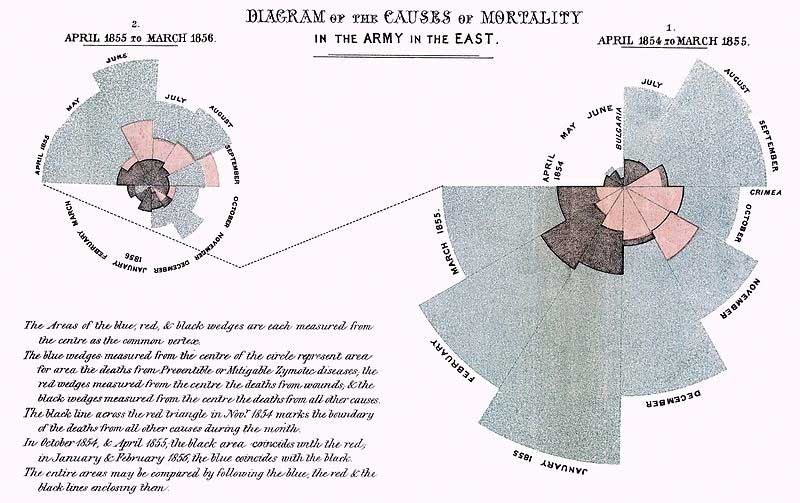
Florence Nightingale: Diagram of the Causes of Mortality in the Army in the East 1858 It was by means of diagrams like this that Nightingale was able to convince the British Military that profound changes in hospitalisation and care of wounded were essential. The clarification that a well-designed diagram brings to a mass of complex data explains why the art/science of information design and data-visualisation have become synch a central part of our intellectual world in the 21st century. These are some of the great pioneers.

Otto and Marie Neurath: Isotypes 1936. With the artist Gerd Arntz, the Neurath’s created a brilliant information-design system specially to humanise the illustration of complex statistics and other quantitive data. Their rationalisation of Isotypes into an information-design system has had a pround impact in this field, not least in the utilisation of simple icons and other symbols in the field of human-computer interface design (initially implemented by Alan Kay and the Xerox PARC team in the Xeroix Alto interface (1973).
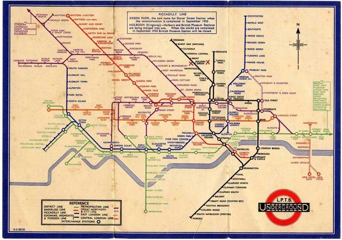
Harry Beck: London Underground Map 1933 Becks brilliant innovation in schematic mapping uses colour-coding, simple symbols, a Gill Sans typeface, and a harmonic grid of horizontal-vertical-oblique to simplify the complex data of a geographical map, while at the same time preserving the logical relationships between stations and interchanges – all this with a stylised River Thames running across the capitol!

In 1982, Philip and Phylis Morrison, who assisted the Eames partnership in the making of the Powers of Ten film, produced a brilliant book of the subject, each page of the main sequence amplifying the image-field by a power of ten. In something like 80 pages the Powers sequence amplifies each step with contextual information, examples of artefacts at that scale – from DNA molecules to Galactic Clusters – informing at the same time as gratifying the senses.
And I started with Kees Boeke’s book not just because it was an original idea, nor because he was the first to visualise this idea, but because the book in its graphic simplicity has a kind of zen purity – a koan quality – that makes it sublime – it is Zen and the Art of Information Design.
