Beatles + BBC: Our World Global TV broadcast: All You Need is Love 1967

Beatles + BBC: Our World Global TV broadcast: All You Need is Love 1967

All You Need is Love  is a song written by John Lennon and credited to Lennon/McCartney. It was first performed by The Beatles on Our World, the first ever live global television link. Broadcast to 26 countries and watched by 350 million people, the programme was broadcast via satellite on June 25, 1967. The BBC had commissioned the Beatles to write a song for the UK’s contribution and this was the result. It is among the most famous songs performed by the group.”(wikipedia)

This was a phenomenal demonstration of the power of music and media. Watching the television that night (a 7-inch Sony Portable), you were straight away immersed in a vision of an emerging world-line where the counter culture interfaced directly with a global television audience. Other countries’ contributions seemed sadly tame and parochial compared with the most popular band in the world revealing their omni-spiritual song – it was a plea for peace (we were at the peak of the Vietnam War), a religious mantra, a pop song, and a direct message from stylish London. The on-stage audience in Abbey Road included Mick Jagger, Marianne Faithful, Donovan, plus a full orchestra, the whole managed as a live Happening, a la Al Hansen. It was epoch-making stuff – the counter culture live on-stage to a global audience. We got close to this vibe again  in 1985 with Bob Geldof’s Live-Aid, but this was the first!

Hans Prinzhorn: Artistry of the Mentally Ill 1922

Hans Prinzhorn: Artistry of the Mentally Ill 1922

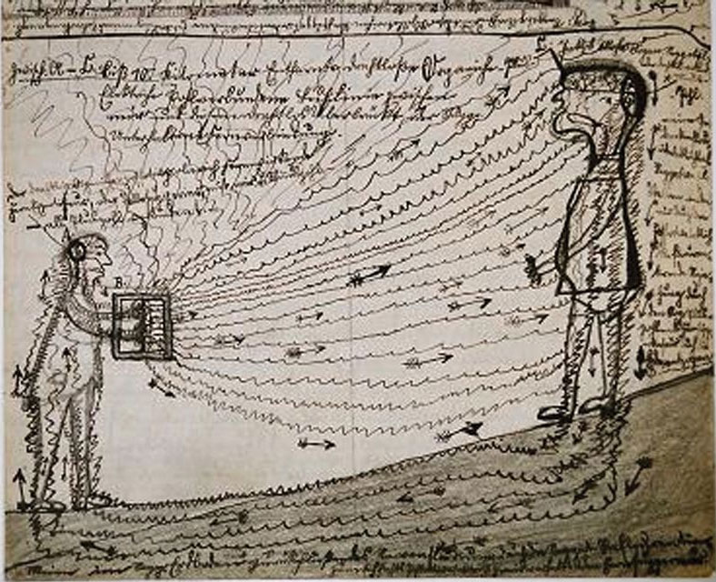
Hans Prinzhorn was a psychiatrist and art historian who had worked with Emil Kraepelin at the University of Heidleberg on a collection of art by mentally disturbed patients. By 1921, when Prinzhorn left Heidleberg, this collection had grown to include over 5000 works by about 350 patients. Prinzhorn’s 1922 book Artistry of the Mentally Ill (profusely illustrated with images from the Heidelberg collection), was the first attempt to analyse this type of art, that subsequently became known as ‘Outsider Art’. Prinzhorn was interested in the borderline between psychiatry and art, mental illness and self-expression, and his work became very influential among artists, especially the Expressionists and Surrealists, with their interest in self expression and in visualising the working of the unconscious mind.

As most serious artists and designers are interested in the act of perception and cognition – the way we transmute the visual and other sensual input from the outside world into mental images – and how we then illustrate these images and evoke them with works of art, Prinzhorn’s book stands out as the first major study to analyse these issues. Of course we know much more now of the workings of the brain, and have begun to develop coherent theories of the Mind (see for example Marvin Minsky’s Society of Mind, and Daniel Dennet’s Consciousness Explained), but the issues addressed by Prinzhorn are still central to these developments. ‘Outsider Art’ is the label now used to describe the art of the mentally ill, the ‘naive’ work of untrained ‘folk artists’, the work of so-called primitive tribes and other similar artefacts, and remains a source of inspiration for artists, nor merely in the radically unconventional images that are produced by ‘outsiders’ but as evidence of these process of perception, cognition and expression that are central to all our experiences of art and design.

Other good books on this subject: Steven Rose: From Brains to Consciousness, Igor Aleksander: How to Build a Mind, and Margaret Boden: The Creative Mind.

Max Ernst + Paul Eluard: Les Malheurs des Immortelles 1922

Max Ernst + Paul Eluard: Les Malheurs des Immortelles 1922

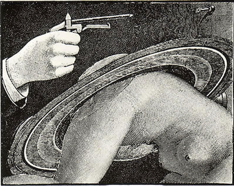
This was the first of Max Ernst’s themed sets of collages, preceding Une Semaine des Bonte, and La Femme Cent Tetes (both 1929). Les Malheurs was produced as a set of illustrations for Paul Eluard’s poem. This range of narrative collages, cut-ups from the vast store of Victorian magazine engravings that Ernst had access to at that time, are brilliant examples of the art of surrealist collage. The line (rather than tone) nature of the source engravings, make it easier to achieve high-quality ‘seamless’ collages, but that does not mitigate against the genius of Ernst’s vision.
U. M. Schneede has commented:
“Disparate elements are here brought together in a less complex and more acute form. The man-beast hybrid makes its appearence and transforms an idyllic interior into a demonic stage-set … The twin starting-points of Max Ernst’s expressive impulse are a search for appropriate avenues for working out in visual terms the private obsessions of his childhood, and also his understanding of the Freudian analysis of such obsessions. His relationship with an authoritarian father, the pressures of middle-class family life, are psychoanalytically interpreted …”
(Uwe M. Schneede 1973)

Tex Avery, Chuck Jones, Ben Hardaway: Bugs Bunny 1940

Tex Avery, Chuck Jones, Ben Hardaway: Bugs Bunny 1940

This fabulously anarchic cartoon character, invented by a team of outstanding artists through 1939-1940, has become a cult favourite of the counter-culture in the US, famously appearing in Robert Anton Wilson’s fantasy conspiracy-theory Illuminatus. Wilson points out that “Although few people remember this, Bugs Bunny was the first UFO “abductee” in a 1952 cartoon called “Hasty Hare.” A masterpiece of cartoon art, Bug’s character development, his manic enthusiasms and hilarious cynicism appealed to the love of chaos and subversion – attributes of the mythical Trickster – in all of us..
http://www.youtube.com/watch?v=2VHf7rB4DPU

Man Ray: Noir et Blanche 1926

Man Ray: Noir et Blanche 1926

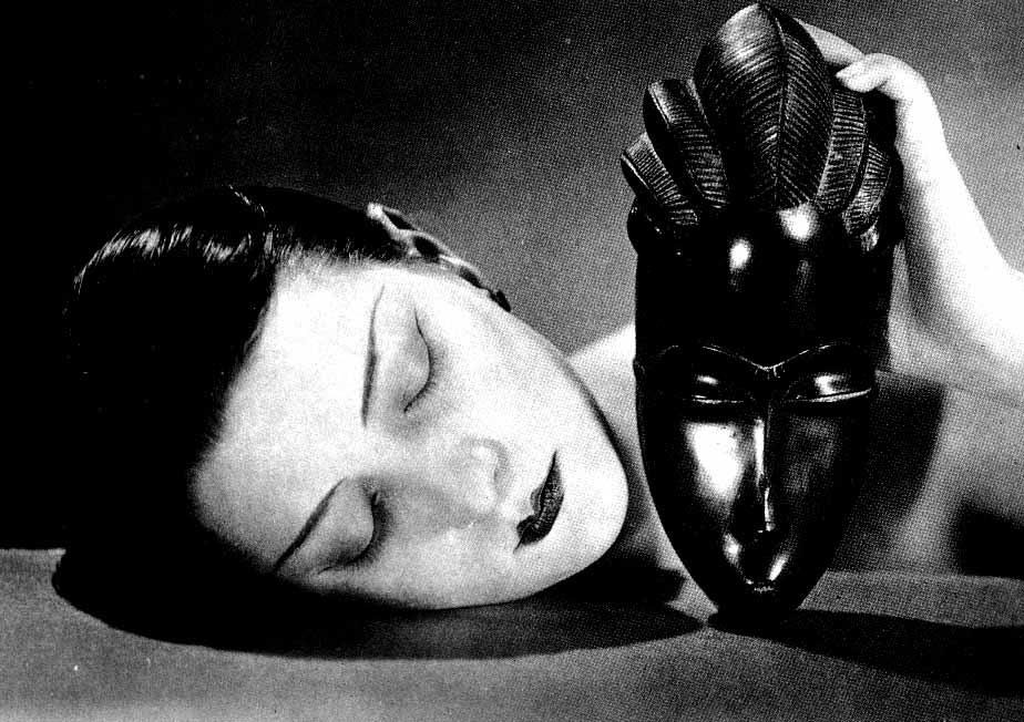
With an art school training and a background in advertising and drafting, Man Ray learned of the European avant garde in New York from 1911, making friends with Duchamp, and visiting the Alfred Steiglitz Gallery, making collages and holding one-man shows of his work. He followed Duchamp to Europe in 1921, and quickly became a leading member of the Surrealists, while working as a fashion photographer for Paul Poiret. He exhibited work in the first Surrealist Exhibition in 1925, and during the 1920s and 1930s photographed many of the leading Parisian artists. During this time he experimented with photograms (direct-exposure photoprints) he called Ray-o-Graphs. In 1926 he produced a series of photographs of Kiki de Montparnasse (star of Leger’s Ballet Mecanique, and Man Ray’s lover), several of which feature the African mask in poetic contrast.

Why does this inspire?
It is in his portraits of the great beauties of the time (including Nancy Cunard, Marie-Laure de Noailles, Kiki de Montparnasse, Helen Tamiris, Berenice Abbott,Lee Miller, Dora Maar and many others) that, more than his portraits of artists, writers and philosophers, capture not just the physiognomy but the zeitgeist (the expression of the essence of the moment) as well. In a period and in an art movement dominated by ideas of the Unconscious, and primitive Ritual, and Art as Magic, the African mask signifies the Primitive for the Surrealist avant garde, and the image of Kiki juxtaposed with the Mask synthesises these ideas – Salon beauty and Primitivism, equally stylised faces…

Piet Mondrian: Composition 1921

Piet Mondrian: Composition 1921

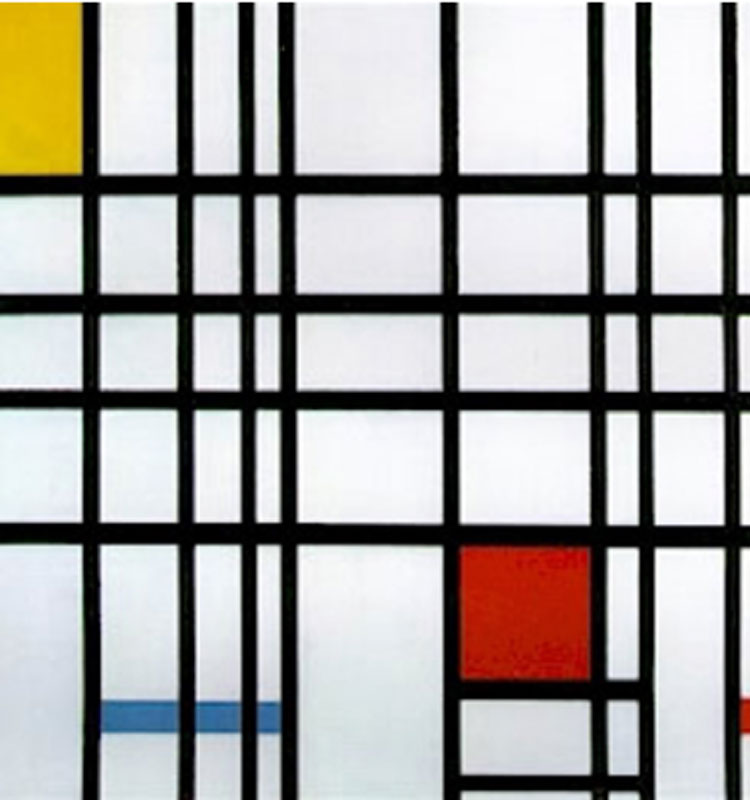
Piet Mondrian was a Dutch painter and member of the De Stijl group (with Bart van der Leck, Gerrit Reitveldt Theo van Doesburg and JJP Oud). His rigorous abstraction and his meditational explorations of the space of the rectangle give him a unique place in 20th Century Art. A follower of the Theosophist Helena Blavatsky, Mondrian spent much of his life searching for the Spiritual harmony that she suggested could be found by non-empirical means…Why does this inspire?
I love how Mondrian’s cool Zen-like (actually Theosophist-like) meditations on the space of the rectangle (and occasionally the diamond) are seemingly simple, yet always intriguing, always harmonius – as if he has found some other Golden Section of harmony..and he’s saying ‘Here it is. It’s that simple.” and I still look and think, letting his subtle rhythms and intervals gradually resonate with my own. These are just fabulous koans – art-poems simplified-down, reduced-down, compressed to their essence, records of his Spiritual quest.

Mondrain said: “The position of the artist is humble. He is essentially a channel.”

He also said:
‘Nature (or what I see) inspires me, gives me, as it does virtually every painter, the emotion from which the urge derives to create something. But I want to approach truth as closely as possible, and thus I abstract everything until I come to the essence (always the external essence!) of things.’

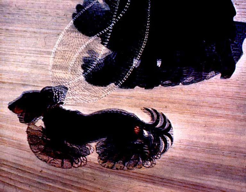
Giacomo Balla: Dynamism of a Dog 1912

Giacomo Balla: Dynamism of a Dog 1912

Balla, trained as a musician, was a self-taught artist. His early work derived from the Impressionists, especially Seurat’s Pointillism. Around 1909 he started painting in a new style, with concerns to depict motion and speed in the new Futurist style, and in 1912 he joined the Futurists. As a teacher he taught Boccioni and Severini – both to become notable Futurist artists. Dynamism of a Dog, along with Duchamp’s Nude Descending a Staircase of the same year, stand out as radical developments of the leading avant garde Cubist movement, and both clearly show the influence of Etiene-Jules Marey’s chrono-photography of the 1870s
Why does this inspire?
Because it was the first example of applied chrono-photography that I came across – researching the picture as a student, I then discovered Marey and Muybridge, Aaron Scharf’s brilliant Art and Photography (1968), and got seriously interested in technology and art.. The close relationship between the medium and the message, explained for me in McLuhan’s early books The Gutenberg Galaxy and Understanding Media, became a lifelong passion.

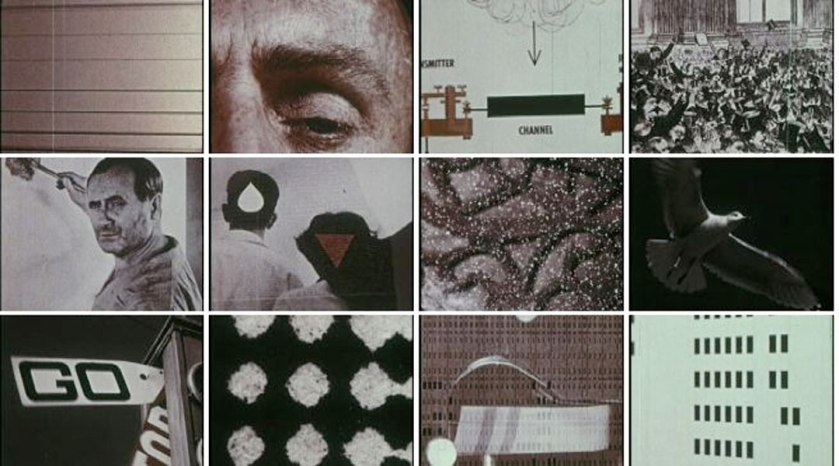
Ray and Charles Eames: A Communications Primer 1953

Ray and Charles Eames: A Communications Primer 1953

This is a seminal film. It is the work of a leading International design team, and it is the first attempt to create a primer or introduction to modern communication theory (ie it is based on the work of Claud Shannon – A Mathematical Theory of Communication, 1948) – it is a multimedia work by two designers at the height of their ideas, and ready to hone their skills using film, graphics, typography and voice-over monologue. An inspirational film that still looks ‘contemporary’ today. The Eames (Charles’ wife Ray was the film-maker) use a variety of media and a range of perspectives to introduce Shannon’s basic theory – the idea of signal and noise in the transmission of any signal from its source to its recipient – clearly to a general public, and without using any complex mathematics. They make Shannon’s then rather obscure theory relevant to everyday communications – only 5 years after Shannon and Weiner (Cybernetics – Control and Communication in Man and Machine, 1948) had established the theoretical and mathematical basis of modern telecommunications.


April Greiman: biographical poster from Design Quarterly 1987

April Greiman: biographical poster from Design Quarterly 1987

Three years after the invention of the Apple Macintosh – one of the key technologies bridging the analogue and digital design epochs -the leading graphic designer April Greiman puts the Mac and its software tools through their paces. In 1984, the Mac was sold with bundled software produced by Apple, including MacPaint (a bitmap editor), MacDraw (a vector-based graphics program), and MacWrite – a cool word-processor. Combining this suite of software to produce a life-size (6-feet long) fold-in poster for an issue of Design Quarterly, Greiman pulls together her fascination with contemporary iconography and reprographic processes and uses a scan of her own body, and her idealised ‘spiritual double’ complete with montaged annotations – all this on a Mac with a one-bit (black or white) screen of 512×342 pixels (about 7 inches by 5 inches), a printer that only printed US Letter size (8.5×11 inches), and a scanner not much bigger than the standard paper size. Greiman, trained under leading Swiss School German designer Wolfgang Weingart, was the first graphic designer to illustrate the potential of digital. Despite the low-resolution, miniature screen size, monochrome limitations, Greiman celebrates these qualities while transcending their limitations, creating an icon of the transition to digital.

This poster was featured in a series of double-page spreads in Greiman’s monograph Hybrid Imagery – The Fusion of Technology and Graphic Design (1990) – in itself a seminal influence on graphic design, and an inspiration for designers, typographers and intermedia artists.

Godfrey Reggio: Koyaanisqatsi – Life Out of Balance 1983

Godfrey Reggio: Koyaanisqatsi - Life Out of Balance 1983

Reggio assembles a documentary-style chronological montage reflecting the impact of industrialisation and population-growth on our planet. It’s like looking at the Earth through the elapsed time vision of an alien watcher, at once beautiful and shocking, like looking into an ant colony as it goes about its business. Philip Glass has produced the mesmeric, iterative score. Ron Fricke is the cinematographer. (ten years later, Fricke went on to produce Baraka (1992). Reggio uses elapsed time, stop motion, slow motion, and other techniques to tell this story. It has a script comprising just one word. It is at once a prayer, a mantra, a meditation and a plea. It is a cool and stylish appraisal of where we are at. It reminded me of the ethos of the Whole Earth Catalog – ‘We are as Gods. We might as well get good at it.’. And it reminded me of Buckminster Fuller’s An Operating Manual for Spaceship Earth.

Commenting on the almost script-less approach to Koyaanisqatsi, Reggio said:

“it’s not for lack of love of the language that these films have no words. It’s because, from my point of view, our language is in a state of vast humiliation. It no longer describes the world in which we live”